Adventist Youth Honors Answer Book/Arts and Crafts/Lettering & Poster Making
| Lettering & Poster Making | ||
|---|---|---|
| Arts and Crafts General Conference |
Skill Level 2 | 
|
| Year of Introduction: 1933 | ||
|
The Lettering & Poster Making Honor is a component of the Artisan Master Award . |
1. Write from memory the complete lower case alphabet in two of the following: Gothic, Roman, or Italic.
[edit | edit source]"Lettering" is often used to have the same meaning as "Calligraphy". This is the case with this honor. The goal of this requirement is to have the student learn two lowercase alphabets for hand lettering or calligraphy that could be used in the creation of signs and posters.
The words Gothic, Roman, and Italic in this case do not apply to the fonts familiar to us on the computers, (although they are related), but more specifically to the type of letters that could be formed with a calligraphy pen, or with any wedge tipped felt marker. Felt markers are particularly useful for poster and sign making.
Gothic
[edit | edit source]The Gothic script (also known as Black Letter) was in common use during the Middle Ages in Western Europe. Because Gothic Script looks antique, it is often chosen to write on certificates, quotes from scripture, or holiday cards.
Wiki Article on Gothic Script
How to form Gothic Script
Sample Gothic script

Italic
[edit | edit source]The italic script is called italic because it was developed in Italy during the early Renaissance period. It was adopted for use by Pope Nicholas V.
Wiki Article on Italic Script
How to form Italic Script
Sample Italic Script
Roman
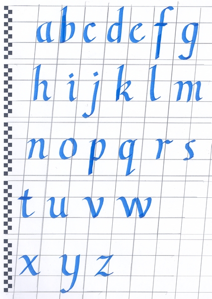
[edit | edit source]Roman letters were inscribed in stone in ancient Rome, and were only capital letters. All modern styles have descended from Roman Capitals. Lower case Roman styles were developed later by Italian scholars. These lower case forms are also known as bookhand, due to its popularity in English language printed materials.
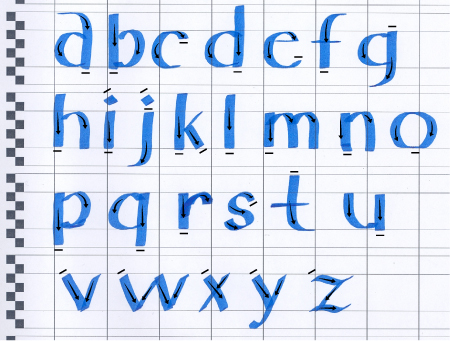
Shown here is a version of Roman, known as Single Stroke Roman. It is called this because unlike some of the more complicated Roman letters, each letter can be created without going over any of the strokes more than one time. This makes Single Stroke Roman very useful for poster making and signs. For most letters the nib is held flat so it is parallel with the baseline. For "s,v,w,x,y,z, and parts of i, j, and k" the pen is angled, somewhere near 30 degrees.
The following example shows the direction to make the strokes, as well as pen or brush angle for this letter type.
Wiki article on Roman Capitals
Foundational
[edit | edit source]Another good alphabet to learn is foundational, also called "round hand".
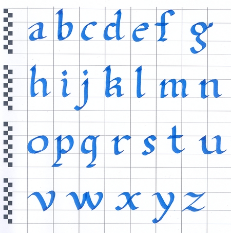
Here are links to a nice site with animations showing how to form this alphabet.
Lower Case and Upper Case
Sans Serif
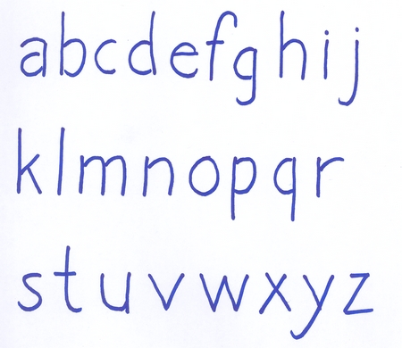
[edit | edit source]Not all alphabets require a wedge tip pen, or nib. A simple sans serif text can be used to create an attractive poster.
You can use a regular round tip felt marker, crayon, or pen to use this alphabet.
2. Demonstrate when the different sizes and types of pens are to be used.
[edit | edit source]Types of Pens
[edit | edit source]There are three basic types of pens used in writing calligraphy.
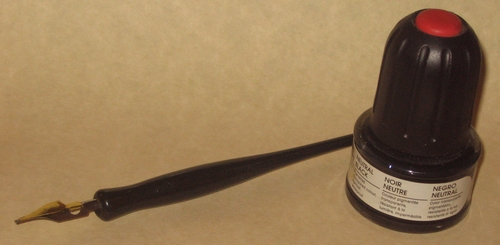
- Dip Pens
Dip pens are simply a metal nib that fits into a solid handle. The nib of the pen must be dipped into an ink bottle as you write.
- Advantages
- Precise interchangeable nibs
- Highest quality of pens available
- Disadvantages
- can be expensive
- difficult to use
- delicate nibs can bend
- nibs can snag paper
- ink can be messy
- must be cleaned after each use
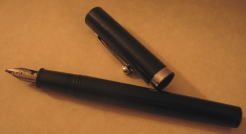
- Fountain Pens
Fountain pens have an ink cartridge in the handle, which supplies ink to the nib. As long as there is ink in the cartridge, you do not have to stop and dip the pen in a bottle.
- Advantages
- Better quality than felt tip pens
- Easier to use than dip pens
- Don't require dipping in ink bottle
- Disadvantages
- not as precise as dip pens
- sometimes the ink can stop flowing on a push stroke
- changing the ink cartridge can be messy and requires cleaning the nib
- Felt Tip Pens
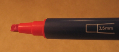
Felt tipped pens are complete with a felt nib, and ink in the handle. Most cannot be refilled, but some of the more expensive art pens can now be refilled, and have the felt tips replaced.

This set of pens are double ended, with a 3.5mm tip on one end, and a 2mm tip on the other.
- Advantages
- Least expensive
- Easiest to use
- Don't leak
- Require no maintenance
- Disadvantages
- Least precise of the three types
- Most (but not all) are not refillable
- Can dry out
- Quality of the line decreases as the felt tip wears (some can have the tip replaced)
Nib Width
[edit | edit source]Pens Come with nibs of varying width. The width of the pens nib, usually measured in millimeters, will effect or determine the size of the lettering. When writing calligraphy, most lettering types are measured in "Nib Widths". Italic script lower case, can be specified as five nib widths in height. The ascender and descender height is also measured as three or four Nib Widths (or N.W.).
In this example, you can see how the size of the lettering changes when a 3.5mm nib is used, versus when a 2.0mm nib is used.
Lettering with Pencils
[edit | edit source]One of the best ways to make lettering for posters is actually with pencils. By placing two regular pencils beside each other and joining with tape, or elastic bands, you can sketch the letters onto a poster, and then use felt markers, paint, or crayons to finish the letters. This is a safe way to make posters, because you can erase any mistakes and redo that spot, while in the sketching phase. If you are making very large letters, you can use 3 or even 4 pencils, with the middle pencils simply used as spacers.
First step is to use the two pencils to sketch the lettering.

Second step is to fill the lettering in using the method of choice. Here the letters are painted in, but other choices could be felt pens, crayons, etc.

Here is a complete sign. Normally I'd not recommend mixing two fill styles like this on the same poster. It's shown here as an example of possible ways to fill in the letters. A common mistake, since computers have become such a popular tool, is to place too many types of lettering or typefaces on the same piece. Best practice is to limit your typefaces to as few as possible. You should have a good reason to use more types, and they should add to the look, not detract from it.
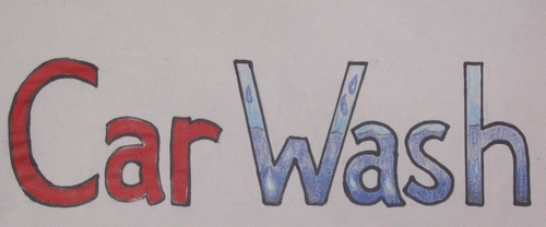
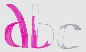
Here you can see the steps. The two pencils are used to sketch the letter, then a black marker is used to make the letter solid, and finally the pencil marks are erased.

In this example, two pencils were used to sketch the letters first. The first two have been filled in with marker, and the third letter started shading with pencil. You can still see the pencil marks here because they have not yet been erased.
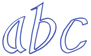
The second example shows how you could create outline letters, by sketching with the two pencil method, and then tracing the lines with a felt marker and erasing the original pencil marks.
3. State at least four principles in making a poster attractive and distinctive. Know how to make correct margins for the size of paper you are using.
[edit | edit source]Margins
[edit | edit source]Margins will vary for different styles and shapes of posters, but there is a way to lay out an standard portrait page that can be helpful.
This involves 3 steps.
- Side margins are calculated at 1/8th of the page width. You can multiply by .125 (12.5%) to find this number. For my example, I'm going to use A4 (210mm X 297mm) paper, This size is close enough to 8.5" X 11" to be considered the same, for this example. Since the page is 21 cm wide, we can find the side margins are 2.6 cm. We can round this down to 2.5 cm for easy calculating. For the 8.5" calculation, we can simply round the page to 8" wide, and calculate 1/8th of that as 1".
- The top margin is then calculated at 80% of the side margins. For the metric folks, 80% of 2.5 cm = 2 cm. For the imperial measure, .8" is pretty close to .75" so 3/4 of an inch would be good to use.
- The bottom margin is simply twice the top. 4 cm or 1.5 inches.
On the left is the standard margins as calculated above. On the right is a page where all four sides are equal. This creates the illusion that that he text appears to be lower than center on the page.

Non-standard paper sizes
[edit | edit source]If you have a page wider than it is tall, it is best to leave more margin on the sides than the top and bottom.

If your page is tall and narrow, better to leave more margin at the top and bottom.

Attractive Posters
[edit | edit source]- Case
Use upper and lower case lettering appropriately. All capital letters is usually difficult to read.
- Contrast
Contrast is an important concept when making posters. Contrast for our purposes can be described as the amount of difference between the background of a poster, and the lettering or other elements on the poster. The more different, or opposite, one is from the other, the higher the level of contrast. Black lettering on a white background is considered the highest level of contrast. Complementary colors also highly contrast with one another.
Below you see an example where the text is only slightly different from the background compared to the black and white version. As you can see, it is very difficult to read the low contrast example.
Contrast can also be created by using two brightnesses of the same colour. In the example below, I show how low contrast and high contrast can be created by using different brightnesses of blue.
Using two different colours, can also create contrast. Highest contrast is between complementary colours on the colour wheel. It is important though that you remember to include brightness as a factor when using complementary colours. In the example below, the orange against the medium blue background gives an appearance of the two colours competing with each other for attention. If I alter the brightness of each colour by lightening the blue, and darkening the orange, a much nicer and more readable colour scheme is created.
The most attractive and attention getting posters have high contrast. If the contrast is too low, it will be difficult to read your poster.
- Creativity
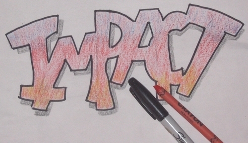
Be creative when making posters. Experiment with lettering to create a desired effect. Just be careful to make sure that the creativity does not make the message hard to read. This example shows a design with custom lettering. It is still easily readable.
- Colour
Adding colour to a poster is an excellent way to create an attractive poster. The most attractive posters will make good use of an artists knowledge of the colour wheel and colour schemes. Keep your colours well organized and planned on the page. Perhaps use colour to highlight the most important part of the poster.
Notice how colour has been used to emphasize the word "Love" in the Pathfinder Motto poster shown below.
Wiki Article on The Colour Wheel.
Wiki Article on Colour Schemes.
- Decorations
Decorations on your poster can be used to attract the eye. Here's a list of some ideas.
- A nice border around the edges.
- Corner designs.
- Interesting horizontal dividers to separate sections of text.
- Drawings to illustrate the theme.
- Themed bullets for a bullet list.
- Visual icons rather than text in some cases.
- Fancy capital letters or initials.
- Patterned background as long as it does not detract from the text.
- Layout
Layout is the word used to describe the placement of items on a page or poster. Planning where each item goes on the poster is important to the overall attractiveness of the poster. Here are some things to keep in mind.
- Layout your poster with headings and subheadings.
- Layout the information into sections.
- The items on the page should have balance and simplicity.
- Choose where you want to add decorations, photographs, graphs, borders and design text around these.
- Avoid presenting too much detail.
- Leave enough white space (background space).
- Information should flow by column or by row.
- Simplify
Keeping a poster simple can be harder than it first sounds. Have you ever walked into a building that had so many items in it, that it was hard to see the beauty of the building? Over-cluttered posters can have the same effect. The message can get lost in the complications.
Here's a list of ideas to keep your posters simple.
- Use only one or two types of lettering.
- Choose a simple colour scheme.
- Use decorations sparingly, and only to strengthen the message.
- Organize the page space, try and have items balanced.
- Have a single message in mind when making a poster.
- Don't mix styles, try and have a uniform approach to text and images.
- Limit your creative elements, you can always use that other great idea on your next poster.
- Further reading.
The following wiki articles may be useful to helping you create an attractive poster.
Illuminated Manuscript
Initials
Graphic Design
Design Elements and Principles
4. Make three posters in a variety of sizes to be used by any of the following groups: Sabbath School, church, school, Pathfinder Club, or AY Society. Use at least two different types of lettering in these posters.
[edit | edit source]One suggestion is to complete one poster of the Pathfinder Pledge, Law, Aim, or Motto. You could complete the requirement for your level in the section on Personal Growth - Commitment. A poster like this would be considered an art project.
- Explorer - Pathfinder Pledge
- Ranger - Pathfinder Law
- Voyager - Pathfinder Aim
- Guide - Pathfinder Motto
Other suggestions might be posters for;
- song lyrics
- school projects Life Orientation
- advertising posters for Pathfinder events
- summer Bible school poster
- memory text poster
- fund raising chart poster
- poster to teach other levels skills or honors
Remember that this requirement is to make posters in a variety of sizes. You do not have to make every poster with large poster boards. Perhaps one can be legal or even letter size. Be creative.
5. Make five additional posters on topics of your own choice. These posters will be judged for acceptance on the following three conditions: a. Arrangement b. Neatness c. Selection in type of lettering used.
[edit | edit source]Some suggestions for topics: Some of these ideas will help you with other Pathfinder honors.
- decorative poster for IT
- get well poster for someone in the hospital
- motivational message for at home
- list of goals for your next year
- emergency phone numbers posted near the phone
- home fire escape plan
- bicycling safety and rules
- lettering on a knot board
- any information learned in a Pathfinder honor class.
6. Practice all strokes until they can be done smoothly and accurately.
[edit | edit source]Making a practice sheet
[edit | edit source]It is a good idea to create a practice sheet for each of the different alphabets you are learning.
- Draw a horizontal line which will be the base of your lettering.
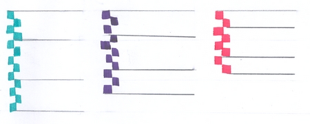
- Holding your pen at a 90° angle to this base line draw the number of squares that you are planning for your descenders.
- Draw a second horizontal line at the top of these squares.
- Now use your pen to make more squares. The number squares you plan for the x-height (main body) of your letters.
- Draw a third horizontal line at the top of these squares.
- Add the number of squares you need for your ascenders next.
- Draw a fourth horizontal line at the top of these squares.
- Repeat this a few times to fill the page with practice lines. You can either photocopy this sheet for practicing on, or use it as a guide under tracing paper.
You can also find sheets like this on the internet available for download and print them, but they may not be exactly the right height for the pen you are using.
Follow the stroke guides
[edit | edit source]Follow the arrows and numbers shown on lettering stroke guides. If you deviate from these guides and try to draw the letters based on their appearance alone, you’ll have trouble forming the letters properly and will likely develop bad habits.

Trace letters to learn
[edit | edit source]It's not a bad thing to trace from a guide when first learning. Don't forget to follow the arrows and numbers in order even when tracing, to avoid forming bad habits.
Strokes for different letters
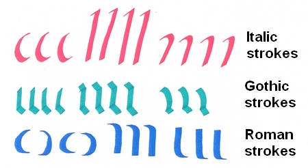
[edit | edit source]Practice some basic strokes. This example shows vertical, horizontal, angled, and curved strokes to practice.

For each alphabet style, practice strokes that are found commonly within the letters.
References
[edit | edit source]- Book:Adventist Youth Honors Answer Book/Artisan Master Award
- Book:Adventist Youth Honors Answer Book/Honors
- Book:Adventist Youth Honors Answer Book
- Book:Adventist Youth Honors Answer Book/Skill Level 2
- Book:Adventist Youth Honors Answer Book/Honors Introduced in 1933
- Book:Adventist Youth Honors Answer Book/Arts and Crafts
- Book:Adventist Youth Honors Answer Book/General Conference

