Usability for Nerds/WYSIWYG
The acronym WYSIWYG stands for what you see is what you get. It is a common buzzword in the design of user interfaces. It means that when you write or draw something in a computer program, then the screen should look exactly as the final document will look when you print it out.
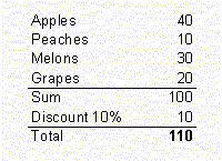
The advantage of the WYSIWYG principle is obvious, but it cannot stand alone. Assume that you have made a spreadsheet like this:

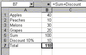
Suddenly, you discover an error: The total price should be 90, not 110. On a strictly WYSIWYG view you may be able to change the bottom line from 110 to 90, but you cannot see or change the underlying formula. What you need is a detailed view where you can focus on the underlying formula:

Now, you can see that the discount has been added, where it should be subtracted, and you can easily correct the formula.
Actually, I would like to have both a WYSIWYG view and a view of the underlying codes or formulas in any software program that can make a visual end product. The two views should be shown side by side so that you can focus on a detail in the WYSIWYG windows that looks wrong and then see in the code window why it is wrong and modify the codes to make it right. Whenever you make a change in one of these windows, this change should be reflected immediately in the other window. Word Perfect is the only program I have seen that fully implements this principle. The picture below shows the user interface with the code window below the WYSIWYG window.

