Using SPSS and PASW/Creating Charts and Graphs
Charts and graphs are a way of organizing data so it can be read and interpreted more easily. In order to choose which type of chart or graph to use you must first decide the level of measurement, i.e., whether the variable is nominal/ordinal or interval/ratio scale. Next, consider the objective behind creating a chart and the target audience. For example, if your audience is the general public, you want your graph to be colorful, uncluttered, and include an overview of the statistics presented. If your audience is more technical, you may want to use more tables.
One rule of thumb to chart design is the “lost in the parking lot” test: if a stranger were to stumble upon your graph, would s/he have enough information in a simple enough format that spontaneous understanding would occur?
As stated before, choosing which type of graph to create requires that you first determine the level of measurement. In statistics, the basic rules are as follows:
- For nominal/ordinal variables, use pie charts and bar charts
- For interval/ratio variables, use histograms (bar charts of equal interval)
Let's now utilize the Genetic Counselors data set to create and interpret different types of graphs.
Pie Charts
[edit | edit source]This classic chart type is particularly useful for conveying the sense of each constituent's share of a total.
To share our own pie, first click on the “Analyze” button. A long menu will drop:

Move your mouse to “Descriptive Statistics” and click “Frequencies”:

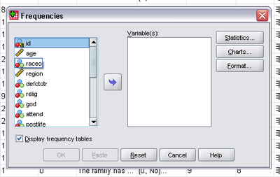
A "Frequencies" window will pop up:

This is the box where you decide which variables to use and the type of graph/chart to create.
Remember that pie charts are based on a nominal or ordinal variable, so we choose one, "relig", the self-reported religious affiliation of our survey participants. Click it and move it to the Variable(s) box by clicking the blue arrow:

Next you want to click on the Charts... button and a new window will pop up, prompting selection of type of chart to create. Click on Pie charts. You can also determine if you would like frequencies or percentages to appear with your pie chart:

For this example, considering the data as percentages of a total will be most useful, so click Percentages and Continue.
This will return you to the “Frequencies” window. Click OK and the Output Window will pop up and display the requested pie chart, with the source data above it:

From this pie chart we are able to easily see that “Protestant” takes up most of the chart and therefore, most surveyed people consider themselves Protestant. By referencing the box above the pie chart we can also determine exact percentages and frequencies, for example, that the Jewish percentage of Genetic Counselors is 9.8%.
Bar Charts
[edit | edit source]Bar charts are useful for projecting a sense of competition among categories. Like pie charts, bar charts are used with variables on the nominal/ordinal level of measurement.
To create a bar chart you use the same steps to create a pie chart, except when the “Frequencies: Charts” window pops up, you of course click Bar charts instead of Pie charts:

Let's create a bar chart of our genetic counselor's religiosity, as measured by religious service attendance, to learn the category that "wins the competition".
Again we click “Analyze” → “Descriptive Statistics” → “Frequencies”, but this time choose variable “attend”, moving it over via the blue arrow, and clicking on Charts..., then clicking on the Chart Type “Bar charts”. Finally, we click Continue and OK. The requested bar chart will be displayed in the Output Window:

Here, just as in the pie chart output, you can see the frequencies and percentages in the box located above the bar chart. As you can also see, the most frequent answer when asked “How often do you attend religious services” is “several times a year”. You can also see that the answers are weighted to the left and with this we can more or less instantly conclude that the genetic counselors surveyed do not, as a group, attend religious services as often as they might.
Histograms
[edit | edit source]Histograms, also known as frequency histograms, are similar to bar charts except that the columns of a histogram touch and are of equal interval.
As stated earlier, interval/ratio variables are used when creating a histogram.
For this example we will use our "age" variable and so see how age varies across genetic counselors. To do this we again click “Analyze” → “Descriptive Statistics” → “Frequencies”.
Next, just like before, move your chosen variable (age) over using the blue arrow and click on Charts..., Histograms, Continue, and finally, OK. The Output Window will pop up, displaying first the frequency table:

And then the histogram:

Through this chart we can see that the most frequent answer when asked each person’s age was just under 30 years old. If you were to look at the frequency chart you would see that 57 people answered 28 years old (the "Valid" bar) and 56 people answer 29 years old. This explains why the bar abutting 30 is highest.
Remember that whenever you present a chart or graph you should provide a clear interpretation geared toward your audience.
Chapter contributed by Caitlin McGrath.
