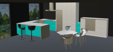
Kitchen Remodel/Kitchen theory
|
Although the name of this chapter may sound scary or unearthly, it is probably the most important one in this book, and if somebody doesn't have the time to read through the entirety of it, I would wish that they start reading here.
The kitchen work triangle revisited
[edit | edit source]
The theoretical concept of the kitchen work triangle was invented and developed in the United States between the 1920s and the 1940s, with Lillian Moller Gilbreth as a pioneer. To submit kitchen design to workflow considerations was a game changer at that time and brought great attention to this part of the home which until then had been rather neglected by designers and architects.
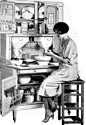
But a lot has changed in kitchens, in kitchen work and in food preparation since Gilbreth and her successors did their groundbreaking research about the workflow between cook top, sink and refrigerator. In 1924, a typical housewife spent more than 50 hours a week in housework, a lot of that cooking and cleaning up after meals. Cooking meant not just meal preparation, but also preparing foods from scratch that today are mostly store-bought, like noodles, pie or cake. The famous Hoosier cabinet which graced virtually every home kitchen at that time was essentially a baking station. The only prepared foods that could be purchased in groceries were bread, sausages, cheese, and butter. In the 1920s, the average household still included more than 4 people. Although a small number of households could afford a domestic servant, housework still meant endless hours of work and severe physical strain for a woman – which is what inspired Gilbreth. For a good reason, she was later introduced into the Women's Hall of Fame.
But the kitchen situation began to change as early as in the 1930s – not as a consequence of Gilbreth's efforts, but for sociological reasons and thanks to technical progress. Households shrank continuously, today they are less than 3 people on average. The number of domestic servants rose after the 1930s, with a peak at the time of WWII, when a fifth of all female jobs were in private households. Then the soldiers returned, female occupation sank (33.9% in 1950) and suburbanization began, with 15 million new housing units being built until 1950. At that time, kitchens were no longer what they used to be for the not so well-off majority of the population. The new kitchens had running water, electrical or gas appliances and uniform rows of cabinets rather than a random selection of individual furniture. In spite of the new conveniences, women spent more time with housework than ever: a whopping 57 hours a week.
But by the 1950s, Americans ate out frequently. Home cooking was on the decline. By the 1970s, many women could afford to stop cooking entirely if they wanted to. By the turn of the millennium, half of all meals were eaten outside the home. Today, women still spend more than 30 hours a week with house work (men: less than 20 hours). In the early 2020s, the average number of meals that were prepared in American households was 8.2 per week, with only 81% of households preparing more than half of their meals at home. If cooking is done, women spend an average of 51 minutes per meal in food preparation and cleanup (men: 22 minutes). More than two thirds of American households have a dishwasher, while interestingly many owners of a dishwasher don't use it on a daily basis, mostly because they are convinced that washing by hand saves them water and energy.
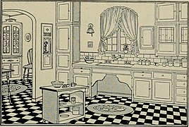
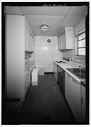
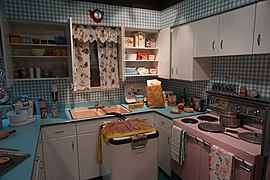
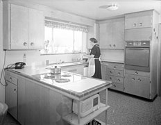
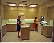
- Half a century of kitchen history in pictures
-
1921
-
1927
-
1928
-
1928
-
1930
-
1938
-
1939
-
1939
-
1948
-
1948
-
1949
-
1950s
-
1950s
-
1955
-
1956
-
1968
Since Gilbreth had first thought about kitchen workflow, kitchen work has tremendously changed. Kitchen work is much less tedious today and both the number of meals that are being prepared in a kitchen and the time spent with the cooking of an individual meal have decreased dramatically, in the U. S. more so than anywhere else in the Western world. Americans spend less time preparing meals than people in any other OECD country: 30 minutes a day on average. But according to polls, the they still spend more than 45 minutes a day doing dishes and cleaning the kitchen! And they still shop for groceries once or twice a week, spending an average of 41 minutes in the store per trip.
It may be high time to reassess kitchen workflow. The work triangle between cook top, sink and refrigerator is certainly not outdated as a concept, even with microwave ovens, crock pots, toaster ovens, air fryers and other appliances competing with the traditional cook top which has become less and less important. But there is obviously much more going on in a kitchen nowadays which is not food preparation: particularly dish washing and (food) storage and organization. I read a lot about kitchen design and kitchen work flow, but I have never found these kitchen tasks mentioned there, although they obviously keep moving up in the ranking list of the most time consuming house works. So I find a distinct irony in it, that the food preparation of all kitchen works – which is more and more considered to be a recreative and enjoyable, merely optional activity – is still being submitted to grave and serious considerations of workflow and efficiency, while other types of work which are really boring and exasperating – most notably clearing off the table, boxing of leftovers, dish washing, and clearing out the dishwasher – have been invariably ignored by kitchen designers.
A new theory of kitchen layouts
[edit | edit source]Commonly, kitchen layouts are classified by the number of rows of cabinets and appliances (one-wall kitchen, galley kitchen, L- shaped and U-shaped kitchen, kitchen with an island, etc.). Namely the kitchen cabinet industry clings to this taxonomy, because it puts the idea into the customers' mind that they should purchase as many cabinets as they can possibly squeeze into their space.
I don't find this taxonomy very helpful because
- it doesn't say anything about workflow, let alone crucial things like the work triangle, working areas, kitchen- and tableware management, and food storage and organization
- those classes are poorly defined, and
- many kitchens don't meet the criteria of any of them.
Finally, from a designers point of view: talking in categories of L or U or G or "island kitchens" will most likely undermine your creative thinking insofar as it will directly guide you into what everybody does.
The work triangle, revised
[edit | edit source]I'd rather suggest a taxonomy that is much simpler, and at the same time applies to virtually any kitchen, no matter how complex or unusual the layout is. I believe that a kitchen – whenever this is possible – should not be designed based on a configuration of rows of cabinets, but based on a chosen configuration of the three elements of the work triangle (cook top, sink, and fridge) and under consideration of both landing spaces for those three elements and of general food preparation space. Think of one point in your kitchen as the very work station of it, where the food preparation happens, comparable to the cockpit in an airplane, where the pilot, comfortably sitting, controls the entirety of the operations of the flight. Ideally, everything that could possibly be needed should be within reach. While you work, you only want to walk away from that work station if it cannot be avoided, and you don't want to have anything in that place that is not related to what you are doing there.
Span the work triangle on a configuration of axes
[edit | edit source]
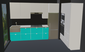
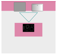
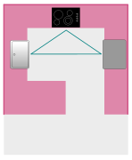
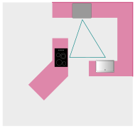
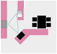
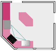
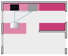
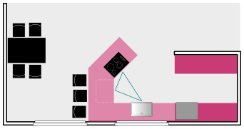
Now think of those three elements as being aligned to axes (see image). In most cases a kitchen will include
- either a single axis (1),
- or two axes:
- either in an angle (2a)
- or facing each other (2b),
- or three axes (3).
Include work and landing space into the work triangle
[edit | edit source]In most cases, cook top, sink, and fridge should not literally touch each other. One important aspect that is not included in the traditional concept of a work triangle are work and landing areas. When Gilbreth developed the concept in the 1920s, virtually all food preparation, except for cleaning and cooking, was done at a table (and, by the way, while sitting); Gilbreth didn't have to point out that there is a need for a work space, because it was understood. But in the recent decades, tables have been vanishing out of kitchens and were replaced by countertop surfaces; in many kitchens, those are not even fully usable because they are filled with small appliances or even with clutter or "decorative" items. Makes you wonder if a table isn't the cleverer alternative.
However, when the work triangle is being planned, it is mandatory to include sufficient designated work and landing areas. Depending on the type of product, all three elements – cook top, sink, and fridge – may require designated landing spaces. Ideally the landing spaces would be directly adjacent to those elements, but in many cases a surface (either a countertop surface or a mobile island or a table) that directly faces the appliance will do just as fine. If at least one of those landing spaces is wider than the length of a rolling pin, it can be used as a generalized food preparation area, too. If none of them is, a wide enough additional work space will become mandatory.
It is understood that the three elements – cook top, sink, and fridge – should not be unreasonably far apart from each other and the walking paths between them should be unobstructed.
In the following sections, I will give examples for all for types of work triangle arrangements:
Single axis
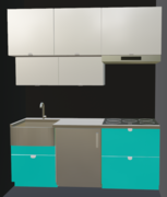
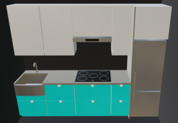
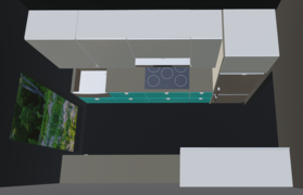
[edit | edit source]Single-axis kitchens are often single-wall kitchens; in a small apartment this can be a space-saver. If there is no more space than for a single row of cabinets and appliances, you naturally end up with one axis.
Single-axis layouts are not quite optimal for workflow: in the case of a small kitchen, because there will be a lack of work and landing areas, and in the case of a large kitchen, there will be long walking distances. But if more axes are not possible, a single axis layout can still work nicely, as long as everything else is well designed. It you have heavy traffic in a kitchen because it is also a through-way, a single axis can even be a safety feature, because nobody can accidentally run you over while you, for example, move a hot pot from the cook top to the sink.
-
For best workflow, the cook top should be in the center.
-
Single-axis layouts often don't offer a lot of countertop space. Every additional inch helps. If the kitchen is very small, either a work station sink or a mobile island may be a great option.
-
This is a single-axis kitchen, too. The additional leg can offer storage or countertop space.
-
Sometimes a second row of cabinets with reduced depth can provide additional storage space.
-
Only in spaces that are wide enough, a second row of full depth cabinets (for storage or countertop space) will fit.
-
Single-axis layouts can be complemented by a peninsula…
-
…or an island. Or all sorts of additions, like a breakfast table or a walk-in pantry.
-
Work station sink for additional work surface in a kitchenette
-
Mini fridge only, for more work surface
-
Notice the landing space left to the fridge
-
Angled fridge orientation for better use of corner space
-
Second leg of cabinets in a 1-axis kitchen
-
Second leg of cabinets in a 1-axis kitchen
-
In this example, the peninsula can serve as landing space for the fridge
Two axes, angled
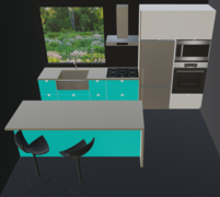
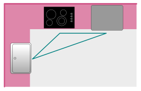
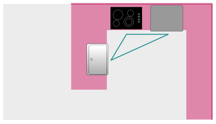
[edit | edit source]To distribute the vertices of the work triangle over two axes, is more desirable than to have only a single axis; if there are two axes you won't have to walk so much, but for many operations will only have to turn around. If there are not technical impediments that speak against it, I would always put the range in the middle for best workflow and for safety (pouring of boiling hot water).
-
The work triangle in a 2-axis layout
-
This is a 2-axis kitchen, too, even without a second row of cabinets
-
Another 2-axis kitchen
-
A 2-axis kitchen which incorporates a peninsula with a sink (with a bar on the exterior side)
-
Another 2-axis kitchen with a peninsula; for this one you'll need an accomplished plumber
-
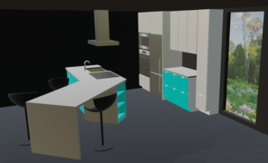
2 axes which include an island; in this case there is not a 90°, but a 45° angle
-
Angled kitchenette, for extra work surface
-
A smallish 2-axis kitchen with some work and landing areas
-
A huge fridge on its own axis
-
More variations of 2-axis kitchens...
Two axes, face to face
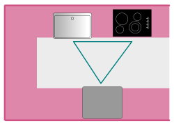
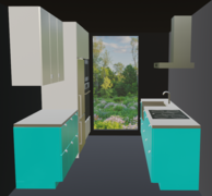
[edit | edit source]A 2-axis kitchen may be associated with a galley kitchen and limited space. But from the workflow perspective, two parallel axes are actually ideal because they can span a equilateral triangle. A 2-axis layout works in small spaces as well as in large spaces, because you can either reduce it to the scope of a galley kitchen (two equidistant rows of cabinets and appliances) or expand it with additional rows of cabinets, a walk-in pantry, a peninsula, an island, a breakfast or dining area, etc.
-
This may be small, but it is a perfect work triangle!
-
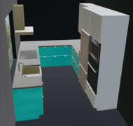
The same situation in a U-shaped kitchen
-
With an island
-
A galley kitchen with a peninsula and a walk-in pantry
-
Classic galley kitchen
-
2-axis kitchen with a third leg of cabinets
-
2-axis kitchen, including a peninsula
-
2-axis kitchen, with a chef's peninsula and a walk-in pantry
Three axes
[edit | edit source]Kitchen layouts with three axes do not in all cases but generally tend to span wider open spaces than 2-axis layouts do, which is beneficial for households with multiple people being involved in food preparation. Only if a 3-axis layout is forced upon too small a space, the result may feel cramped.
-
The work triangle in a U-shaped kitchen
-
The third axis can be on an island
-
Another layout that includes an island
-
Layout with a peninsula as the third axis
-
Peninsula as a mere addition to a 3-axis layout, for storage or a bar
-
3 axes, including a peninsula and an island
-
Similar, but the third axis is oblique
-
Classic U-shaped 3-axis kitchen
-
The same, with a chef's peninsula
-
With an extended chef's island
-
With a peninsula and a chef's island
-
With two peninsulas
Beyond the work triangle
[edit | edit source]Common kitchen theory with its focus on the work triangle tends to ignore that is not just food preparation and cooking going on in a kitchen, but also:
- food storage organization
- setting the table
- serving dishes
- clearing off the table
- boxing and disposing of left-overs
- dish washing and
- clearing out the dishwasher
In many households these operations can become actually more prominent than the mere food preparation. But on all accounts, it would be silly to plan a kitchen without those in mind.
Dining and tableware management area requirements
[edit | edit source]
The work processes that involve your dining area should be give the same thorough consideration as the food preparation. In my own design, I went so far as to assign an entire peninsula specifically to those functions: storage of tableware and utensils, machine dish washing, and landing. The landing area serves multiple purposes:
- before a meal: parking of tableware and utensils while those are being taken out of the cabinets, for choosing, counting, and screening
- final arranging of dishes before they are being carried to the table
- during and after a meal: parking of used tableware and utensils before those go in the dishwasher
- boxing of left-overs
As I will point out in the next chapter, I tend to avoid placing a dishwasher beside the kitchen sink, but would rather combine it with those cabinets where I keep my everyday tableware and utensils. This saves you tons of walking. To avoid noise in a living area during times when the area is populated, the dishwasher's timer function can be used.
-
Three distinct functional areas: dining and tableware management (left), food preparation (center), pantry (right)
-
Similar, but with a tableware management peninsula
-
Similar, but with a raised dishwasher
Food storage requirements
[edit | edit source]
While some groceries – like milk, cooking oils, spices or whatever you use on a daily basis – should obviously be kept within the food preparation area for best workflow, there are others that are not regularly used and therefore don't need to be stored in the immediate vicinity of the work triangle.
In larger spaces, it makes a lot of sense to include a pantry in the kitchen layout, either as additional cabinet space or a walk-in pantry. Currently, even butler's pantries see a revival, although it is certainly disputable if it is a good idea to extend the walking distance that lies between a kitchen and a dining room.
From a kitchen designers perspective, a full scale pantry offers many opportunities for interesting layout ideas. One example is the chance to radically downsize the refrigerator that you implement in the work triangle, even the freezing compartment can be omitted. Instead, there can be a large refrigerator and possibly even a separate freezer in the pantry.
-
cabinet pantry
-
wall pantry
-
freestanding pantry
-
passage-way pantry
-
walk-in pantry
-
butler's pantry
Common kitchen layout problems
[edit | edit source]Very small kitchens
[edit | edit source]There are many, many tricks how you can maximize the space in a small kitchen, it is absolutely worth to extensively read about this topic on the internet. Wall hung cabinets for example should reach all the way up to the ceiling even if you have to climb a chair to reach them; you may even consider two levels of wall cabinets, with 24" (60 cm) deep cabinets on top for extra storage (see images further up on this page). A work-station sink can provide additional work surface. In some cases, I may make sense to raise the countertop surface a few inches above the standard level; this will create additional space for example to fit a mini refrigerator under a cook top, or an extra drawer or a pull-out cutting board somewhere.
My probably best suggestion would be to omit the in-sink-erator and to hire the best plumber that you can get. Challenge them to mount the waste water trap not conventionally but turned 90 degrees and flush to the wall (check out Ikea's water trap "Rännilen" for inspiration). When the trap doesn't stick out you can have heaps of shelf space and even drawers under that sink.
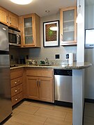
For inspiration, I love to check out hotel room kitchenettes. Chains like Marriott hire expensive designers to develop kitchens that are both minimalist and clever:
-
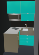
It is puny, but they still managed to make it an L shape for better workflow.
-
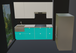
Huge fridge! Notice the cook top being positioned between fridge and sink.
-
No attempt for corner cabinets. But actually some countertop space.
-
There is even a little bar!
Large kitchens
[edit | edit source]Yes, large spaces are a challenge for a kitchen designer, too! An probably even more of a challenge than a small space, because there are way more layout options between which you need to make an informed decision, plus you'll probably don't want the space feeling like one big ballroom but nicely broken down into a set of subdivisions, each of which serve their own purposes.
Common layout mistakes
[edit | edit source]Avoiding of corner cabinets
[edit | edit source]Corner cabinets are a nuisance. As shown in the previous section, they offer astonishingly little space that is easily accessible – no matter how much money you spend on gimmicks such as Lazy Susans or blind corner pull-outs or blind corner organizers. Here are some ideas how corner cabinets can be avoided altogether:


