Template:Block
Use, Limitations, Parameters and Options
[edit source]Not to be confused with Template:Blocked.
Use
[edit source]The template has one parameter: Content; unformatted text for the box. The default state produces a pale blue band across the page for a centered Courier text entry; it is useful to emphasise a single code line.
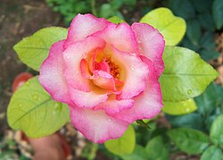
The options can be used in a more elaborate way to assemble a page with contiguous coloured background sections; see the example, which includes an image. The code to call the template into use and the result of doing so is seen below:
{{block|ta=left|ff=Arial|background=Lightyellow|color=blue|[[image:rose.jpg|left|150px]]This is a block of fictitious text {{lorem ipsum}}}}{{block|background=papayawhip|{{lorem ipsum}}}}{{block|ta=left|fs=12pt|ff=serif|background=mistyrose|{{lorem ipsum}}}}
- Which in easier on the eyes mode, including added whitespace to let elements 'POP'
- instead of being all jammed together like we are all programmers or have young eyesight!
{{block |ta=left |ff=Arial |background=Lightyellow |color=blue
| [[image:rose.jpg |left |150px ]]This is a block of fictitious text {{lorem ipsum}}}}
{{block| background=papayawhip |content= {{lorem ipsum}} }}
{{block |ta= left |fs= 12pt |ff= serif |background= mistyrose |{{lorem ipsum}}}}
- which generates

Limitations
[edit source]It is not possible for the parameter text to start with a wikitext heading, (==Heading==); use the HTML form instead, (<h2>Heading</h2>.
A Wikitext table will not render at all well. Use an HTML table instead and avoid having the table at the start of the parameter.
At times which are not yet clarified, using the named parameter form, (1= The parameter text...), works well when the unnamed equivalent,(The parameter text...) does not.
Options
[edit source]In exploring Wikibook templates there are a number of shorthands used as parameters. The capitals herein were added as alternative mnemonic 'timesaver' options since they are variables also used in quite a few other formatting and box templates found here on Wikibooks... and on the commons.
- AS
- menomically 'ANY STYLE COMMAND' — an added option for some parameter not in the list below. Last thing in the style format string, it should override any default it contends with earlier in the string. Defaults to a nil string, contaminating nothing by leaving behind a lonely semi-colon.
- display
- display mode, default block, can be set to inline for wrapped text sections. First item in the style string.
- background, BG
- background color, pale blue
- color, CO
- font color, black
- ff, FF, FACE
- font family or face, Courier
- fs, FS, SIZE
- font size, 10pt
- ta, ALN
- text alignment, center
- lh, LH
- line height, 1.4em
- M
- margin, auto
- MW
- max-width, 100%
- padding, P
- content padding.
The defaults produce a pale ivory band in the page for a centered text entry, in a monospaced font.
- The smoke and mirrors ...
- does not really exist. These templates merely reduce somewhat painstaking repetitive html code wrappings to a user friendly macro. These perform the coding needed to generate portable standard html for bulleted paragraphs:
 <td style="padding:2px 5px 2px 5px;">
 <ul><li>{{{content|{{{1}}} }}}
 </li></ul></td>
Note the use of <td>...</td> elements, firstly says they expect a table element wrapper. Secondly suggests they can be alternated within <tr>...</tr> wrappers to form a line with multiple columns, creating first a table with specific width parameters so they follow the leader, and stay in their own lane on each subsequent line.
- See related templates... often use this as a lead wrapper...
- Use {{Lul}} and {{Dul}} to make the bullet lead strips of light and dark alternating color text blocks.
- Use {{Lightul}} and {{Darkul}} without a container, in a stack for full page widths or when the amount of text is sufficient to form more than one line for every bullet point.
- Use {{container}} to include and bound combinations of the above listed beside an image, and with this template. (See example in {{container}}.
