Using SPSS and PASW/Print version
| This is the print version of Using_SPSS_and_PASW You won't see this message or any elements not part of the book's content when you print or preview this page. |
Note: current version of this book can be found at http://en.wikibooks.org/wiki/Using_SPSS_and_PASW
Installing SPSS
[edit | edit source]SPSS is a software package designed for statistical analysis. This chapter will illustrate how to install SPSS 16.0 on Windows 7.
Obtain SPSS
[edit | edit source]The first step, of course, is to obtain a copy of SPSS. This can be done online via the SPSS store [1] or, if you are in an educational setting, your computer store or bookstore may have physical copies available for purchase.
Insert Disc Into Disc Drive
[edit | edit source]In Windows, once you insert the SPSS installation disc you will likely receive some sort of prompt as the disc will "autoplay." The initial prompt in Windows 7 looks like this:

Select "Run setup.exe".
Follow Prompts to Install
[edit | edit source]Once you select "Run setup.exe", you'll get an autoplay window like this one:

Select the very first option, "Install SPSS 16.0". You'll then have to click through a series of windows asking you to set various options. The default options are typically fine. The following screenshots illustrate these windows:

Unless you are installing a site license or network license, the single user license is the option you want.

You have to accept the License Agreement in order to continue installing SPSS.
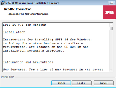
This window contains a ReadMe with installation instructions and a list of changes to SPSS. It is generally a good idea to read documents like this, but not necessary. Click "Next".

This window asks for your User Name and Organization name. Fill them in. It also asks for your Serial Number. You do not typically have to complete this at this point as you can complete it in the License Authorization stage. But you can enter it in if you'd like. Click "Next".

This window asks you where you want to install SPSS. Unless you have a reason to change the default directory, you can simply click "Next."

This is the last prompt before the software will be installed. Simply click "Install."

You should then see a progress bar as the software is installed.
Once the software is installed, it may or may not automatically start the License Authorization Wizard. If it does not, you can select it from the Start Menu:

Authorize the License
[edit | edit source]Once the software is installed, you need to Authorize your copy of SPSS using the License Authorization Wizard. This may start automatically. If it does not, you can select it in the Start Menu. The License Authorization Wizard shows you a series of windows that allow you to authorize your license and avoid a 14 day time limit. This is the first window:

The easiest option is simply to "Register with spss.com", but you can also register via email or over the phone. These options are presented to you if you unselect "Register with spss.com, which is selected be default.
Following the prompts in these windows, you will arrive at a window where you can enter your license and serial number into the window. That information is checked and then your copy of SPSS is licensed. A screenshot of that window is not included as it includes the serial number of the author of this book. But upon completing the licensing, you will see this window:

Once you see this screen, your installation of SPSS is complete. You can select "Finish" then start SPSS. How to start the software is covered in the next chapter.
Installing GNU PSPP
[edit | edit source]Ubuntu Linux
[edit | edit source]If you are using Ubuntu Linux, you can open the software center and install SPSS.
Opening SPSS
[edit | edit source]Opening SPSS
[edit | edit source]There are two ways to open SPSS. The first way is quite simple if the SPSS icon is already on your desktop all you have to do is double click the icon:

Double-clicking the SPSS icon should open the program, as illustrated below:

Alternatively you can open SPSS through the start button on your computer (if you're running Windows). If the SPSS icon is not on your desktop you must go through your computer's Start button. Click “Start” → “All programs” → “SPSS Inc.” From this point if you have more than one version of SPSS on your computer you have to pick the version you are going to open. I am going to use version 16.0. From here click SPSS 16.0 , and finally click the SPSS 16.0 icon. All the steps are shown below in a screen shot:

If you followed the steps above when you click SPSS 16.0 the program should open on your computer.
Chapter contributed by Joseph Ranalli
Opening a dataset
[edit | edit source]Opening an Existing SPSS Data File
[edit | edit source]This chapter will explain how to open new and already saved data sets. Once you have SPSS open (see Chapter 2), click "File" → "Open" → “Data”:

After clicking the Data icon, SPSS will pull up a screen called “Open Data.” Open Data will give you option to find your data set. This can be seen in the screen shot below:
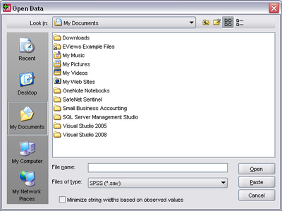
Browse through your directories until you find your data set, then select it and click “Open.” Your data set should now be open:

Opening a New Data Window
[edit | edit source]If you'd rather enter data into a blank data file, you can create an empty SPSS data file. To do so, once you've opened the program, click "File" → "New" → "Data"

The result will be a blank or empty data file. You can enter data in the Data View (Chapter 4) and set variable characteristics in Variable View (Chapter 5).

Chapter contributed by Jennifer Gadarowski
Understanding the Data View
[edit | edit source]The Data Editor window of SPSS has two tabs that provide different information, the data, and data on that data (the metadata). This page explores the former, the Data View tab.
The tabs are shown in the bottom left corner of the Data Editor window, as shown:

The Data View tab shows the raw data in your data set. The rows represent individual cases. If your level of analysis is people, then each case represents one person. Here are three:

The columns represent variables. Each column contains all individual case data on that particular variable. The "id" column:

A cell, at the intersection of a row and a column, represents one observation/measurement/datum.
Depending on the size of your data set, as with a spreadsheet, you may need to scroll up or down to see more cases or left or right to see more variables.
The Data View tab in SPSS also allows you to modify your raw data. You can do so by simply clicking on any cell in the Data View tab:

Once you click on the cell, if you begin typing, you will replace all of the information in the cell. If you double-click on a cell, you can modify the contents without replacing them:

While a nice feature of SPSS, the ability to modify your raw data is dangerous to the cavalier, as it makes it easy to change your raw data. Changing your raw data should never be undertaken lightly or without backup as it will change your analyses. Recent versions of SPSS include an "undo" feature, but not all changes in SPSS can be undone.
It is good practice to work on copies of original data, only, and to keep backup files so that you can restore your data to good condition in the case of mishap.
Additionally, you should know that the Data View can be manipulated much like a spreadsheet. E.g., by clicking a column or row header, then re-clicking it, you can move columns and rows to rearrange them:

Moving through the data can be accomplished using the arrow keys, the page up and down keys, and the home and end keys as you might expect. One useful habit is to use the tab key to move right across a case's variable values. The tab key wraps around the data when it encounters an empty, undefined column, moving down to the start of the next case.
Additionally, you can sort by variable values, which is illustrated in sorting data.
Understanding the Variable View
[edit | edit source]The Variable View tab is another tab in the Data Editor window in addition to the Data View tab, which was discussed in the last chapter. Again, you can select between the tabs at the bottom left corner of the Data Editor Window:

In Variable View, the rows correspond to variables, not cases. This view does not show raw data but rather metadata, information/settings/characteristics of the variables included in the data set. The metadata of two variables:

The columns provide information about the various characteristics of the variables. The "name" column with part of the "type" column:
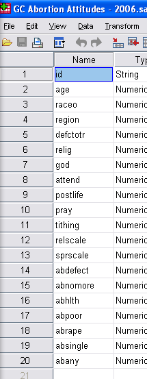
There are 10 metadata columns total. Each explained:
| Column | What it Means |
|---|---|
| Name | The variable's name. Older versions of SPSS were limited to 8 character names. New versions of SPSS are not, but lengthy descriptions better belong in the Label column. |
| Type | The data type of the variable. There are 8 options: Numeric, Comma, Dot, Scientific notation, Date, Dollar, Custom currency, and String. Most variables that beginning users will encounter will be either Numeric or String. Numeric variables are numbers that either map to a value (e.g., 1=Catholic) or are the value of interest (height=73 inches). String numbers are text and can only be treated as such. As a result, very few manipulations can be performed on them. |
| Width | This column indicates the number of characters available for the variable values. |
| Decimals | This column allows you to control the number of numerals after the decimal place. |
| Label | This column allows you to provide a more extensive description of the variable. |
| Values | This column allows you to provide a key for what the numbers of a numeric variable may represent (e.g., 1=Catholic, 2=Protestant). |
| Missing | This column allows you to indicate which values mean missing. Values marked as missing are excluded from analyses in SPSS. |
| Columns | This column indicates the total number of columns a variable's values may have. |
| Align | This column indicates the alignment of the variable in the Data View, viz., Left, Right, or Center. |
| Measure | This last column indicates the level of measurement of the variable, viz., Nominal, Ordinal, or Scale. See next page. |
Every variable in your data set should have all columns that are relevant for it filled out. An example of an irrelevant column would be "Values" for an ID column, as that has a unique value in each row.
Understanding the Output Window
[edit | edit source]Whenever you run an analysis in SPSS, the results will automatically open in the Output Window.
Often, when the Output Window first opens, SPSS will still be shown to be Processing... your requests. Once the analysis is complete, the Output Window will display the results, e.g.,

The above is an Output Window after descriptive statistics were run on a variable “age”. The window includes menu bar tooling to edit, save, and print results, as well as a left panel with a special hierarchical tree of links to the output in the main panel that allows you quick output navigation. That left panel again:

“Output”, the root of the tree, represents the whole output window. If your SPSS preferences are set as ours were to "include Syntax in the log" (next page), “Log” will be the next item, pointing to your "Using SPSS and PASW/SPSS syntax", i.e. the SPSS language commands that produced your output. The next item, “Frequencies”, indicates that a frequencies analysis was conducted. Included first in that are the "statistics", i.e., the mean, median, and mode of the variable “age”:

Next comes the frequencies table, reporting the absolute number of each age found in our study participants:

Finally, because of the /HISTOGRAM NORMAL portion of our Syntax, a histogram of the variable “age” is given, complete with normal curve:

Thus, the Output Window serves two purposes. It presents the results of your analyses, and keeps a record of everything you've done (if you turn on the syntax; see next page).
Chapter contributed by Kimberly Duggan.
Changing Preferences to Include Syntax in Output
[edit | edit source]The previous chapter mentioned Syntax and how it may be included in the Log of your Output Window.
Syntax usually refers to a language's rules of valid sentence and phrase formation but it is also what SPSS has chosen to name its user command language.
By default, SPSS logs into the Output Window the Syntax commands corresponding to its user's GUI commands, retaining a history of every command run. Note this is also an opportunity to be painlessly tutored in use of Syntax. (The utility of learning Syntax is explained on page Using SPSS and PASW/SPSS_syntax.)
If your Syntax logging is turned off and you want to turn it back on, the below shows how.
First, what basic analysis looks like without Syntax:

To tell SPSS to include Syntax in your Output Window, click “Edit” → “Options.”

Once you click Options, this window will pop up. Click the "Viewer" tab.

On the “Viewer” tab, check the box at the bottom left hand that says “Display commands in the log.”

Click “OK.”
Now run any analysis and the Output Window's Log will include the Syntax. This is illustrated below with a Frequencies analysis:

Chapter contributed by Christine Fernandez.
Changing Preferences to Order Lists Alphabetically
[edit | edit source]This page will illustrate how to change SPSS' settings in order to have its variable lists alphabetically sorted.
By default, SPSS arranges the variable list in the same order as found in the data editor, however, arranging the list alphabetically is useful when you have many variables, because it allows searching for variables by simply pressing the first letter of their name: the selected list item will jump to the first matching variable name.
To set SPSS to display the variables alphabetically is easy. To begin, click “Edit” → “Options”:

After having selected the “Options” tab, you will see this window:

Select the "Display names" and “Alphabetical” options in the “Variable Lists” box on the top left:

Click on the “OK” button as shown above.
Once you have done this, another dialog notifies that any dialogs currently open will be closed. Click “OK” once again:

To see the new behavior, check any option that includes a variable list, e.g., click “Analyze” → “Descriptive Statistics” → “Descriptives”:

You should end up with a window similar to the below one, with the variables in the left hand side box ordered alphabetically:

You can now easily search through a list of variables by typing in the first letter of a variable name: SPSS will jump directly to it.
Chapter contributed by Clarine Ovando-LaCroux.
Recoding Variables
[edit | edit source]This page shows how to facilitate statistical analysis by creating new SPSS variables via recoding, i.e., remapping values from existing variables.
Let's say you want to combine or “collapse” categories because the number of responses in one category is too small for statistical analysis.
Instead of having ages range from 1-100 and having 100 options as it does when on a ratio scale of measure, you could recode age into ordinal variable ageCategory that has just three values: 29 and under, 30-60, and 61+.
When recoding variables, it is generally a good idea to first write the desired mappings between the values of the old and new variables, as illustrated in the table below.
Here, a variable measuring frequency of religious attendance is used to demonstrate the technique:
| Old Codes | New Codes |
|---|---|
| 0=never | 1=never to infrequently |
| 1=less than once a year | 1=never to infrequently |
| 2=about once or twice a year | 1=never to infrequently |
| 3= several times a year | 1=never to infrequently |
| 4=about once a month | 2=relatively frequently |
| 5=two to three times a month | 2=relatively frequently |
| 6=nearly every week | 2=relatively frequently |
| 7=every week | 2=relatively frequently |
| 8= several times a week | 2=relatively frequently |
| 9=no answer | 9=no answer |
It is time to actually perform our recode. Drop the “Transform” menu at the top of data editor window:

Click on “Recode into Different Variables”, as choosing the “Recode into Same Variable” would destroy the values of the existing variable. (The only time you'd use that is when fixing fouled labels.)

You will now see the “Recode into Different Variables” window. Choose the source variable from the list on the left and click the arrow (which then points left) to insert the variable into the “Numeric Variable → Output Variable” box. In this example, variable "attend" is selected for recoding:

Now type the new variable name and label in the “Output Variable” box and click Change.

Now click “Old and New Values.” You'll get the following window:

For each row of our table at top, enter Old Values on the left, New Values on the right and click “Add”. That will put them into the “Old → New” list. As you can see, our screenshot shows original values 0 through 3 have been recoded as “1.” Values 4 through 8 have been recoded as “2” in the new variable. These recodings could have also been specified as ranges, by selecting the radio button next to “Range” and entering a range of source values.
When you are finished, click “Continue” and “OK.”
That will return you to the Data Editor window. In the Data View, drag the new variable from the very last column down and left until it is next to the column it recodes.
You might expect this to be done for you but the final step is to click the Variable View tab, and in the new variable's Values cell, edit the Value Labels to reflect the newly recoded values:

Click “OK” and you’re done.
Chapter contributed by Megan Hauf.
Computing Variables
[edit | edit source]Computing variables in SPSS refers to computing with existing variables to create new variables.
One common reasons is creation of a scale measure that combines several existing variables into a single variable, such as to summarize a phenomenon of interest.
In our Genetic Counselors study, a subject investigated was attitude towards (an unpleasant operation, my apologies) abortion. Participants were asked a set of seven questions to learn in what circumstances s/he believed abortion should be allowed. E.g., Do you think a woman should be allowed to obtain an abortion if she has been raped? If she doesn't want any more children? Et cetera. While the individual questions are useful for gaining a sense of the participant's views on whether or not abortion should be legal in specific cases, by combining the variables it is possible to get a better overall measure of opinion on abortion permissiblity. Specifically, we could simply add the number of Yes answers across the seven questions for a sum for each study participant of 0 to 7.
To simultaneously create and compute this variable, which we'll call abscale, click “Transform” → “Compute Variable”:
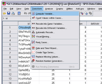
The resulting window allows you to specify a numeric computation using existing variables:

On the left, under “Target Variable,” is where you name the new variable. Under “Numeric Expression,” you build a formula using the numeric keypad, mathematical operators and functions, and the variables in your data set. Combine these elements as desired. To move a variable into the “Numeric Expression” box, highlight it and click the arrow key.
In our example, seven variables are added to create the new scale: abscale. To do this we have only to add the abortion variables, as shown above. Once you're done, click “OK.” Your new variable will then appear in the Data Editor under the “Variable View,” on the ultimate row.

You'll notice that a “Label” value is missing, a void we recommend you always immediately fill with a descriptive label, e.g., "views on abortion; should range from 0 to 7".
In order to ensure that you created the scale accurately, check the frequencies and/or descriptives: click “Analyze” → “Descriptive Statistics” → “Frequencies”:

Click your newly created variable, then the arrow to move it into the “Variable(s)” box, and you will get a window like this:
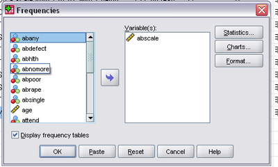
Click OK and your Output Window will show a frequency distribution table for your new variable:

Following these steps, you can realize any new variables math, your data, and interest can conceive, with an assurance that your intentions have been met.
Chapter contributed by Gen Guzman.
Creating New Variables
[edit | edit source]The previous page showed how to create a new variable by Transform of an existing one. In this exegesis we will show you how to create entirely new variables.
Creating a new variable is a foundational skill for users of SPSS, as it is necessary to perform many statistical tests and procedures (see Part II).
Step one in creating a variable is switching the Data Editor window to “Variable View”, by clicking on its tab:

Then click in the first empty row and provide your nascent variable with a name, e.g., “Age”:

You can specify the type of the variable by clicking in the cell under the column labeled “Type.” An ellipsis will appear:

Click on the ellipsis to open the Variable Type Dialog box, which looks like:

Most variables will be “Numeric,” meaning they will be number based, either because the number itself is meaningful (interval/ratio variables) or because it represents distinct categories. Other common variable types are String, for text, Date, and Currency. Select the desired type and click OK.
Next, input a label (description) for your variable as a whole:

Moving right in the Variable View, the next field is Values. Click there and then on its ellipsis to expose

If the variable is ordinal you must assign a unique number to each label. E.g., for a variable holding participant race you might specify "1" as Value with "White" as the Label, and continue with such mappings as 2=Black, 3=Native American, etc.
Next up is Missing. Click here and as usual on the ellipsis to specify how missing (did not respond, not applicable, lost, etc) values will be denoted so they are not used in any calculations by default:

While you have free hand to choose your designation, it is common to uses iterations of 9 to indicate missing values in numeric fields, where that value would otherwise be impossible. For instance, if a variable holds an integer in range 1 - 4 plus a missing value, you can assign a “9” to indicate that a value is missing. If there are 20 categories, "20" is two decimal places and <99, so you could use two “9”s to indicate a missing value in that variable, and so on. If the variable is of type String, you would usually use more description missing values, such as "NA".
Finally, you must specify your level of measurement. This may be done by clicking on the cell under the column labeled “Measure” and choosing from Nominal, Ordinal, and Scale:

Nominal and ordinal variables should be labeled under their corresponding names, while interval and ratio variables should be labeled as “Scale.”
Repeat this process for as many variables as you need to create.

Chapter contributed by Damian Patrinostro.
Sorting Variables
[edit | edit source]One of the functions you will often want to perform in the Data View of the Data Editor is sorting by a variable's values, to bring those of similar value together. This can be a very useful when exploring the raw data in your dataset. There are two ways to do this. One is quite simple, the other allows for sorting on more than one variable.
The simple way to sort variable values is to make sure you are looking at the Data View tab. Then scroll to the variable by which you want to sort. Right click on its column heading and a context menu will appear:

At the bottom of the context menu are two sorting options: "Sort Ascending" and "Sort Descending." Choosing the first will move the smallest values to the top of the data set while a descending sort will bring up the largest values. Keep in mind that SPSS automatically (unlike Excel) moves all rows in unison, so you don't need to worry about cases becoming misaligned when sorting.
Sometimes it's useful to sort on multiple variables, which means that SPSS will sort the data set by the values of the first variable, then breaks ties in that sort by sorting on the values of the second variable, and so on.
To sort on multiple variables at once, choose "Data" -> "Sort Cases":
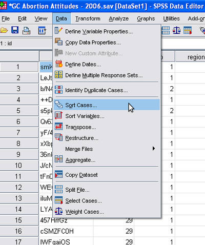
You'll get this dialog window:

The "Sort Order" box allows the choice between Ascending or Descending order once again. On the left is a list of all the variables in the data set. Choose them, the most important sort first, by clicking the variable involved and then the blue arrow, and repeat:

Save your data set after sorting to retain it as the default sorting.
Creating Charts and Graphs
[edit | edit source]Charts and graphs are a way of organizing data so it can be read and interpreted more easily. In order to choose which type of chart or graph to use you must first decide the level of measurement, i.e., whether the variable is nominal/ordinal or interval/ratio scale. Next, consider the objective behind creating a chart and the target audience. For example, if your audience is the general public, you want your graph to be colorful, uncluttered, and include an overview of the statistics presented. If your audience is more technical, you may want to use more tables.
One rule of thumb to chart design is the “lost in the parking lot” test: if a stranger were to stumble upon your graph, would s/he have enough information in a simple enough format that spontaneous understanding would occur?
As stated before, choosing which type of graph to create requires that you first determine the level of measurement. In statistics, the basic rules are as follows:
- For nominal/ordinal variables, use pie charts and bar charts
- For interval/ratio variables, use histograms (bar charts of equal interval)
Let's now utilize the Genetic Counselors data set to create and interpret different types of graphs.
Pie Charts
[edit | edit source]This classic chart type is particularly useful for conveying the sense of each constituent's share of a total.
To share our own pie, first click on the “Analyze” button. A long menu will drop:

Move your mouse to “Descriptive Statistics” and click “Frequencies”:

A "Frequencies" window will pop up:
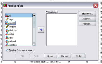
This is the box where you decide which variables to use and the type of graph/chart to create.
Remember that pie charts are based on a nominal or ordinal variable, so we choose one, "relig", the self-reported religious affiliation of our survey participants. Click it and move it to the Variable(s) box by clicking the blue arrow:

Next you want to click on the Charts... button and a new window will pop up, prompting selection of type of chart to create. Click on Pie charts. You can also determine if you would like frequencies or percentages to appear with your pie chart:

For this example, considering the data as percentages of a total will be most useful, so click Percentages and Continue.
This will return you to the “Frequencies” window. Click OK and the Output Window will pop up and display the requested pie chart, with the source data above it:
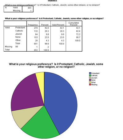
From this pie chart we are able to easily see that “Protestant” takes up most of the chart and therefore, most surveyed people consider themselves Protestant. By referencing the box above the pie chart we can also determine exact percentages and frequencies, for example, that the Jewish percentage of Genetic Counselors is 9.8%.
Bar Charts
[edit | edit source]Bar charts are useful for projecting a sense of competition among categories. Like pie charts, bar charts are used with variables on the nominal/ordinal level of measurement.
To create a bar chart you use the same steps to create a pie chart, except when the “Frequencies: Charts” window pops up, you of course click Bar charts instead of Pie charts:

Let's create a bar chart of our genetic counselor's religiosity, as measured by religious service attendance, to learn the category that "wins the competition".
Again we click “Analyze” → “Descriptive Statistics” → “Frequencies”, but this time choose variable “attend”, moving it over via the blue arrow, and clicking on Charts..., then clicking on the Chart Type “Bar charts”. Finally, we click Continue and OK. The requested bar chart will be displayed in the Output Window:

Here, just as in the pie chart output, you can see the frequencies and percentages in the box located above the bar chart. As you can also see, the most frequent answer when asked “How often do you attend religious services” is “several times a year”. You can also see that the answers are weighted to the left and with this we can more or less instantly conclude that the genetic counselors surveyed do not, as a group, attend religious services as often as they might.
Histograms
[edit | edit source]Histograms, also known as frequency histograms, are similar to bar charts except that the columns of a histogram touch and are of equal interval.
As stated earlier, interval/ratio variables are used when creating a histogram.
For this example we will use our "age" variable and so see how age varies across genetic counselors. To do this we again click “Analyze” → “Descriptive Statistics” → “Frequencies”.
Next, just like before, move your chosen variable (age) over using the blue arrow and click on Charts..., Histograms, Continue, and finally, OK. The Output Window will pop up, displaying first the frequency table:

And then the histogram:

Through this chart we can see that the most frequent answer when asked each person’s age was just under 30 years old. If you were to look at the frequency chart you would see that 57 people answered 28 years old (the "Valid" bar) and 56 people answer 29 years old. This explains why the bar abutting 30 is highest.
Remember that whenever you present a chart or graph you should provide a clear interpretation geared toward your audience.
Chapter contributed by Caitlin McGrath.
Frequencies
[edit | edit source]Frequencies, in statistics, refers to counts of categories or responses. It's a basic statistical tool that provides a sense of how often specific response options occur in a population.
Using the sample data set, let's say we want to know the geographic distribution of genetic counselors. Fortunately, in the sample data set, there is a variable, "region", that in combination with the Frequencies function in SPSS, will tell us what we want to know.
Let's begin. Click "Analyze" -> "Descriptive Statistics" -> "Frequencies":

The "Frequencies" window will appear:

Scroll through the variables until you find the variable you want. In our example, we're interested in "region", so click the arrow to move that variable into the "Variable(s):" box:
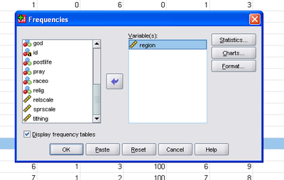
Then make sure that the "Display frequency tables" box is checked and click "OK". In the Output Window you should see

Note that there are two tables in this output. The first breaks down the frequency of valid region data versus missing. The second table shows frequency distribution with four labeled columns.
The first, labeled "Frequency", simply reports the number of cases that fall into each category of the variable being analyzed. E.g., exactly 100 of our genetic counselors live in the "pacific" region.
The second column, "Percent", provides a percentage of the total cases that fall into each region. The percentage of genetic counselors of the total that we know work in the "pacific" region is 15.3%.
The third column, labeled "Valid Percent," is a percentage that does not include missing cases. Without them, "pacific" region's share increases to 16.5%.
The fourth column, "Cumulative Percent", adds the percentages of each region from the top of the table to the bottom, culminating in 100%. This is more useful when the variable of analysis is ranked or ordinal, as it makes it easy to get a sense of what percentage of cases fall below each rank.
We hope this provides a sense of the utility of SPSS' Frequencies calculation.
Descriptives
[edit | edit source]Descriptive statistics are used to describe variables. Examples of descriptive statistics include: mean, median, mode, standard deviation, and range. Here we'll describe how to have SPSS calculate three of them, the mean, median and mode, for a variable “age”, plus introduce the concept of skewed distribution.
In order to generate descriptives in SPSS, you first need to open up a data set. In this book a Genetic Counseling example data set is utilized.
Once it's open, we click “Analyze” → “Descriptive Statistics” → “Frequencies...”:

A Frequencies Window will appear on the screen. Select the variable labeled “age” on the left and click the blue arrow to move it into the Variable(s) box:

Please then click on the Statistics... button. A new window will appear, with a grouping named "Central Tendency." There, select Mean, Median, and Mode and click Continue:

Once the box disappears, click “OK” in the Frequencies Box. The valid versus missing breakdown, along with the mean (average), median (middle), and mode (most common) age of participating genetic counselors will appear at the top of the Output window:

In the example above, the mean age of participants is 35.93. The data set's median age is 33, and the mode is 28.
Distribution Curves in SPSS
[edit | edit source]If you want to see where the mean, median, and mode fall on a frequency distribution curve, SPSS can show you. This is useful when you are trying to determine if your value's distribution is normal or skewed. (A discussion of skewness statistics is beyond the scope of this book).
Please repeat the above example, again utilizing the variable of “age”, until the “Frequencies” window is open again. Click the button labeled “Charts...” to open a window offering Chart Type:

Select the radio button labeled “Histograms” and check “With normal curve.” Click “Continue” then “OK” and your chart will pop up in the Output box:

The frequency curve in this example shows a positively skewed distribution, i.e., values off the normal curve in a positive direction.
Chapter 15 contributed by Kristin Mraz.
Confidence Intervals
[edit | edit source]Confidence Intervals help us estimate the precision of our statistics relative to the sampled population. Confidence Intervals are a range of values of a parameter, e.g., a mean. We express this interval with a specific degree of confidence. This degree of confidence tells a reader how confident we are that the population parameter falls within our stated interval.
For this example, we will use the variable “sprscale”, representing answers to question “How Spiritual do you consider yourself?” in our example data set made up of genetic counselors. This variable allowed the sample of genetic counselors to rank how spiritual they are on a scale of 1 to 10.
To compute a confidence interval in SPSS, you begin by selecting “Analyze” → “Descriptive Statistics” → “Explore.” Once the “Explore” window pops up, scroll down on the left list until you find “sprscale,” then click on the arrow that will send it to the dependent list:

Now, click on “Statistics” to pop up a smaller window:
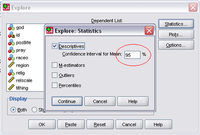
Check the “Descriptives” box and type in the level of confidence that you would like to use. For this example we'll use 95%. Click “Continue” then “OK.” The Output Window will now pop up with a variety of statistics, including the confidence interval:

The confidence interval we found for how spiritual Genetic Counselors are on a scale of 1 to 10 is 5.99 to 6.36. We interpret this in plain language by saying “We are 95% confident that the true mean spirituality on a scale of 1 to 10 for the population of genetic counselors is between 5.99 and 6.36.”
Page contributed by Lauren Takemoto.
Single Sample Means Tests
[edit | edit source]A single sample means test is a statistical test that can determine whether or not a population estimate (i.e., sample statistic) is significantly different from a known value.
A hypothetical example may help illustrate this. Let's say a national survey of the adult population asks how religious people are on a 10-point scale, ranging from 1 being "not at all religious" and 10 being "very religious." And let's say that the mean on this scale in the U.S. is 6.01. With our sample of genetic counselors, we can ask whether or not genetic counselors are similar to the general population in their religiosity. To do this, we use a single sample means test, which takes into consideration sampling error. Similar tests are possible for proportions (i.e., with nominal/ordinal variables), but SPSS cannot do those. How to do a single sample means test in SPSS is illustrated below.
To begin with, go to "Analyze" -> "Compare Means" -> "One-Sample T Test":

The "One-Sample T Test" window will open:

Select the variable you want to compare to a target value, then move it into the "Test Variable(s):" box:

The next part is absolutely essential and easy to overlook the first time you run this. In the "Test Value" box below the "Test Variable(s):" box you need to put the target value. In our case, we'll put 6.01:

(Note: It's not uncommon for beginners to leave the "Test Value" box blank. And, for some reason, SPSS puts a default value in the box of zero, which means the test will run if you don't put your target value in the box as SPSS will assume your target value is zero. Just make sure you put the correct target value in the "Test Value" box.)
The results will open in the Output Window:

There are two tables. The first simply describes the sample and variable included in the analysis. The N, Mean, Standard Deviation, and Standard Error of the Mean are all included. Of particular interest for the example, the mean religiosity score of genetic counselors is 4.65, which is lower than our hypothetical religiosity of the U.S. population generally. However, the question is whether or not this is due to random error or an actual affect of genetic counselors.
The second table tells us whether or not the difference between the two is likely due to chance. The first column is the t-statistic. Using a t-table, one could use this value to determine whether or not the two means are significantly different. SPSS does the calculations for you. The next column, "df," provides your degrees of freedom, which is n-1 for single sample means tests. The third column, Sig. (2-tailed), provides the p-value for this particular test, which is the probability of finding the difference between the genetic counselors' mean and the general U.S. adult population mean we found (again, this is hypothetical) simply due to random error (assuming they are actually the same). In our example, the p-value is .000, which is smaller than the standard p-value used in statistics of .05, indicating the odds of us finding this difference if the population means are the same simply due to chance is less than 1 in 1000. In this case, we would reject the null hypothesis that there is no difference and accept the alternative hypothesis that there is a difference between genetic counselors and the general population in their average religiosity.
Independent Samples t-test
[edit | edit source]An independent samples t-test is used for comparing the means on an interval/ratio variable between two categories on a nominal/ordinal variable. It answers the question of whether the difference between means is statistically significant in the population of interest (assuming good sampling) or whether the difference is due to sampling error. To do this test, you need two variables from one population and sample. The independent variable is nominal/ordinal and the dependent is interval/ratio.
To illustrate this concept, this chapter tests to see if there is a statistically significant difference between whether or not Genetic Counselors believe in life after death and how spiritual they consider themselves.
To run the t-test you will click “Analyze” → “Compare Means” → “Independent Samples T-Test”:

Since the spirituality scale is the interval/ratio variable it will act as the dependent variable. That is, how spiritual one considers himself depends on his belief in life after death. Find the spiritual scale variable (labeled “sprscale”) and click the arrow to move it over to the test variable section. Next, find the views on life after death variable (labeled “postlife”) and click the arrow to move that over to the grouping variable section.
You will see question marks next to the grouping variable. This is because SPSS allows you to choose which categories of the independent variable you want to include (the variable could include more than just two categories). You will need to tell SPSS which groups to compare by clicking the “define groups” button. To find these labels, go back to the Data Editor in Variable View and click on the “Values” button for the “postlife” variable. You will see this screen:

The above screenshot shows that not believing in an afterlife is labeled “0” and believing is labeled “1.” Once you know what your values are for believing in an afterlife, return to the t-test dialog. In the define groups window, add zero for “No” and one for “Yes”:
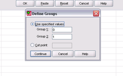
Once you've defined your groups, click “Continue.” You'll return to the primary “Independent-Samples t-test” window:

Click OK, and SPSS will run the T-Test. Two tables will appear in the output:

A lot of information appears in these tables. The first table is simply the “Group Statistics” table, which includes: sample sizes, means, standard deviations and standard errors of the means.
The second table, labeled the “Independent Samples Test,” is what you use for determining whether or not you can reject the null hypothesis. Because you are comparing two means, two different variances are obtained. There is a long equation used to determine which variance to use, but SPSS does this for you by running the Levene’s Test for Equality of Variances. If the variances are relatively equal, that is one sample variance is no larger than twice the size of the other, then you can assume equal variances. By looking at the output of the Levene’s test you decide which row to use. If the significance is .05 or below, use the bottom row, or “equal variances not assumed.” If the significance is above .05 use the top row. In this example, since the significance is .000, we'll examine the bottom row.
Both the top and bottom row provide the same information, they just use different tests to calculate the test statistic, which results in slightly different calculations. This table provides the test statistic or t value, the degrees of freedom and other values helpful for determining confidence intervals. A key statistic provided is the p-value, listed in the “Sig (2-tailed)” column. If your p-value is greater than .05 you fail to reject the null (meaning the difference in means is likely due to chance or sampling error). If your p-value is less than .05 you can reject the null (meaning there is in fact a statistically significant difference in the means and it is not due to sampling error). In this case, you can reject the null hypothesis (because the significance is .000, which is substantially less than .05).
You should always interpret your analysis, “How spiritual someone considers him/herself is affected by someone's belief in an afterlife.”
Chapter contributed by Alison Moser.
Paired Samples t-test
[edit | edit source]A paired samples t-test is a test that is useful when you have two interval/ratio variables from the same people in a sample that are measured exactly the same way. You can use a paired samples t-test to compare the scores on the two variables. The most common use of this test is for pre- and post-test scores for a sample when they are exposed to some intervention in between the pre- and post-tests. The reason a paired samples t-test is used instead of an independent samples t-test is because the scores are for the same people, which suggests there is an underlying relationship between the scores.
Another time paired samples t-tests are useful is when you have two variables with the same units of measure from the same subjects from the same time and you want to see if the subjects score differently on one test compared to the other. This is the example we will use in this chapter to illustrate the test. In the sample data set of genetic counselors, there are two interval variables that have the same unit of measure - a 10 point scale. However, one variable asked genetic counselors how religious they were and the other asked them how spiritual they were. Since it is the same subjects being asked different questions that use the same metric, we can compare their scores on these two variables using a paired samples t-test.
Here's how this is done in SPSS. To begin with, select "Analyze" -> "Compare Means" -> "Paired-Samples T Test":

The "Paired-Samples T Test" window will open:

To select the variables to compare, you have to actually select two variables at the same time. To do this, select the first variable, then hold down "Control" and select the second, then move them over to the "Paired Variables" box with the blue arrow:

Then hit "OK." You'll get the following tables in the Output Window:

The first table provides basic sample and variable statistics for the two variables, including the Mean, the sample size, the Standard Deviation, and the Standard Error of the Mean. Of interest in our comparison are the two means. On the spirituality scale, genetic counselors report a mean of 6.17. On the religiosity scale, genetic counselors report a mean of 4.64. Those appear to be quite different scores, but the question of interest is whether those scores are different due to chance or due to an actual affect in the population. The paired-samples t test allows us to determine that.
The second table, a correlation table, is discussed in the chapter on correlation, so it will not be discussed here.
The third table is the "Paired Samples Test" table. The first column is labeled the "Mean" and it is the average difference between the two variable means. The "Std. Deviation" and "Std. Error of the Mean" are calculated on the average mean in the first column. Columns four and five are lower and upper confidence intervals for the difference. For more information on confidence intervals, see the chapter on confidence intervals. The sixth column, "t", is the t-score. The seventh is the degrees of freedom. The eight column provides the p-value for the difference of means. In our example, the p-value is .000, which is less than a standard alpha of .05, indicating that the odds of these two scores being different due to random chance assuming they are actually the same is less than 1 in 1000. In this case, we would reject the null hypothesis that they are the same and accept the alternative. There is a significant difference between the religiosity and spirituality of genetic counselors; genetic counselors are significantly more spiritual than they are religious.
Chi-Square
[edit | edit source]The Chi-Square test is used when trying to find a relationship between two nominal or ordinal variables. To reiterate, a nominal variable is one that is only measured by naming categories such as class, quality or kind. An ordinal variable is similar to a nominal variable, but the categories can be put in an order (e.g., ranked highest to lowest).
To calculate Chi-Square, we use a cross-tabulation, crosstab for short, which shows the frequencies of joint occurrences between two variables.
The hypothesis we will test in this chapter is whether or not there is a relationship between religious affiliation and belief in the afterlife. We will test this using an alpha of .05. To do a Chi-Square test in SPSS, complete the following steps:
You must have two nominal variables from a single sample that you can use to see if there is a relationship between them. For this example we will use religion (relig) and belief in the afterlife (postlife). For this example religion is the independent variable and belief in the afterlife is the dependent variable. This will be important later.
To run the test, select: Analyze → Descriptives → Crosstabs.
Once you click Crosstabs, a window will pop up where you will enter your chosen variables to be tested. Select the independent variable (relig) to go in the column and the dependent variable (postlife) to go in the row.

Next, click the statistics button and check the Chi-Square box.

Hit continue and then click on the cells button and check observed, expected and column percentages.

Then hit OK and an output window with the resulting cross-tabulation will pop up.

Next you must interpret the data. At the bottom of each column and end of every row there is a total for that specific group. The bottom right cell is the total number of cases in the sample. In each cell, it shows the observed joint occurrence between the two variables and the expected occurrence based on the totals that were observed. If there is NO relationship between the variables, the observed and expected frequencies will be the same. For our example, this is clearly not the case. They are different but we must look at the last box from our output window to see if our relationship is legitimate or if it was due to sampling error.

As we stated in the beginning, our alpha is .05. If the “Asymp. Sig. (2-sided)” for the Pearson Chi-Square statistic is less than .05, there is a relationship between the variables based on the level of confidence we stated in the beginning. As seen in the table below, the Chi-Square significance value is .000 which is less than our value of .05 which shows that there is a relationship between one’s religion and their belief in the afterlife.
Finally, we interpret the test in everyday terms, which also means we look more closely at the crosstab table as well. In the crosstab table it is clear that Protestants and Catholics are much more likely to report a belief in the afterlife than are Jews or Nones. Thus, we can say, “Jews and the non-religious are significantly less likely to believe in an afterlife than are Protestants and Catholics.” Do note that care must be taken in interpreting Chi-Square crosstabs as it is not always perfectly clear where the significant differences between scores lie.
Chapter contributed by Sarah Friswell.
ANOVA
[edit | edit source]ANOVA is an extension of the two group difference of means test (t-test). The t-test is used to compare two group means, but ANOVA allows for comparing three or more group means, which is easier than conducting numerous t-tests.
To conduct a One-Way Analysis of Variance (ANOVA) test in SPSS, you must first begin by choosing two variables. The variables we will use in this example are religious affiliation and frequency of prayer. Basically we are asking, “Does religion affiliation have an influence on how often people pray?”
Once you know what you want to compare, you can tell SPSS to run the analysis by clicking on “Analyze” → “Compare Means” → “One-Way ANOVA”:

The One-Way ANOVA dialog box will appear:

In the list displayed on the left, click on the variable that corresponds to your dependent variable (should be an interval/ratio variable). In our example this is frequency of prayer. Move it into the Dependent List by clicking on the upper arrow button. In this example, we are asking if religious preference has any effect on how often people pray.
Now select the (quasi) independent variable from the list on the left and click on it. Move it into the Factor box by clicking on the lower arrow button. In our example this is religious affiliation.

Click on the Options button in the One-Way ANOVA dialog box. The One-Way ANOVA dialog box appears:

Click in the check box to the left of Descriptives (to get descriptive statistics), Homogeneity of Variance (to get a test of the assumption of homogeneity of variance) and Means plot (to get a graph of the means of the conditions).
Click on the Continue button to return to the One-Way ANOVA dialog box. In the One Way ANOVA dialog box, click on the “OK” button to perform the analysis of variance. The SPSS output window will appear. The output consists of six major sections. The first is the descriptives section:

The Descriptives table provides various descriptives for the groups being compared, including the group sample size, mean, standard deviation, minimum, maximum, standard error, and confidence interval for the mean. In this example, there were 64 Jewish individuals, the mean frequency of prayer was 4.70 (on a six point scale; technically it is an interval-like ordinal variable), and the standard deviation was 1.217. There were 132 Catholic individuals with a mean frequency of prayer at 3.38, and a standard deviation of 1.438.
The ANOVA output gives us the analysis of variance summary table. There are six columns in the output:
| Column | Description |
|---|---|
| Unlabeled (source of variance) | This column describes each row of the ANOVA summary table. It tells us that the first row corresponds to the between-groups estimate of variance. The between-groups estimate of variance forms the numerator of the F ratio. The second row corresponds to the within-groups estimate of variance. The within-groups estimate of variance forms the denominator of the F ratio. The final row describes the total variability in the data. |
| Sum of Squares | The sum of squares column gives the sum of squares for each of the estimates of variance. |
| Df | The third column gives the degrees of freedom for each estimate of variance. The degrees of freedom for the between-groups estimate of variance are given by the number of levels of the IV-1. In this example there are five levels of the independent variable. |
| Mean Square | The fourth column gives the estimates of variance (the mean squares). Each mean square is calculated by dividing the sum of square by its degrees of freedom. |
| F | The fifth column gives the F ratio. It is calculated by dividing mean square variance between-groups by the mean square variance within groups. |
| Sig. | The final column gives the significance of the F-ratio. This is the p-value. If the p-value is less than or equal to your alpha level, then you can reject null hypothesis that all means are equal. In our example, the p-value is .000. |
Here is the actual ANOVA table from the example:

Based on this analysis, we can conclude that religious affiliation does significantly affect frequency of prayer for genetic counselors.
Chapter contributed by Sheena Wright.
Correlation
[edit | edit source]Two variables can be considered to correlate when there is a systematic change in their scores. The purpose of correlation is to improve estimates and/or make predictions about a population. Simple linear correlation is particularly useful for improving best estimates of a dependent variable by accounting for its relationship with the independent variable using the straight-line formula.
In SPSS we are able to run correlations between two interval/ratio variables. To do so, click on “Analyze” → “Correlate”. You will be shown three options. If you have two interval/ratio variables, choose “Bivariate….”

The pop up window will ask you to select two variables to move into the “variable” box to the right of the window. Select the variables of interest. In this example, we will use a religiosity scale and a spirituality scale as our two variables. Make sure that the box next to Pearson’s r is checked.

Then Click “OK.”
You'll get the following table:

This table is called a correlation table. On the diagonal each variable is correlated with itself, thus they are perfect correlations of 1.0. The table is also symmetrical, meaning the cells above the diagonal are identical to those below the diagonal, thus you really only need to examine one set of cells – either those above or below the diagonal.
As far as what the cells tell us... The first value in the cell correlating religiosity with spirituality reports a correlation coefficient of .585. Correlation coefficients range from -1.0 to +1.0. An absolute value of 1.0 indicates a perfect correlation, which is rare in the social sciences. A negative correlation means that as one variable goes up, the other goes down. A positive correlations mean that as one variable goes up, the other also goes up. A correlation of .585 is positive, meaning as religiosity increases, so, too, does spirituality. But the correlation is not perfect, meaning some of the variation in spirituality is not explained by the variation in religiosity.
The asterisks at the end of the correlation indicate that the correlation is significant. The p-value of the significance is indicated in two places – at the very bottom of the table where the asterisks are defined and just below the correlation coefficient, where the p-value is provided. In this case, the p-value is .000, which means the odds of finding this relationship between these two variables just due to chance is less than .001, or less than 1 in a thousand. This indicates there is a significant relationship between religiosity and spirituality.
The last value in the cell is the sample size for the correlation – 646. If you were to correlate more than two variables simultaneously, which you can do in SPSS by simply adding more than two variables in the correlation dialogue, the sample sizes being compared can vary due to things like missing values or non-response.
Technically, before conducting a correlation, one should always run a scatterplot to insure that the relationship between the two variables is linear. This is done in SPSS by clicking on “Graphs” → “Chart Builder”.
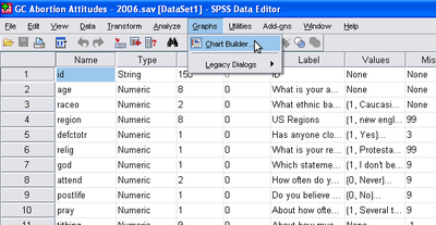
Once the Chart Builder window is open, click on Scatter Plot. Select the first display example of a scatter plot graph and drag the display into the large box located towards the right of the pop up window. Select your independent variable from the side scroll bar and drag it to the X-axis on the box to the right. Select your dependent variable from the side scroll bar and drag it to the Y-axis on the box to the right.

Once this is done, click “OK.”
You will get something similar to the graph below:

This scatter plot illustrates that there is something like a linear relationship between the two variables. Basically, no one who scores high on religiosity scores low on spirituality. However, there are some people who score low on religiosity but who score high on spirituality. Even so, the general trend is a linear relationship, which means these two variables are suitable for correlation and regression analysis.
Chapter contributed by Brittany Harder.
Ordinary Least Squares Regression
[edit | edit source]Ordinary Least Squares (OLS) regression (or simply "regression") is a useful tool for examining the relationship between two or more interval/ratio variables. OLS regression assumes that there is a linear relationship between the two variables. If the relationship is not linear, OLS regression may not be the ideal tool for the analysis, or modifications to the variables/analysis may be required. The basic idea of linear regression is that, if there is a linear relationship between two variables, you can then use one variable to predict values on the other variable. For example, because there is a linear relationship between height and weight, if you know someone's height, you can better estimate their weight. Using a basic line formula, you can calculate predicted values of your dependent variable using your independent variable, allowing you to make better predictions.
To illustrate how to do regression analysis in SPSS, we will use two interval variables from the sample data set. These same variables were used in some of the other chapters. Genetic counselors were asked to rate how religious and spiritual they consider themselves on a 10 point scale - higher values indicate more religious or more spiritual. In the analysis below, we are going to see how well religiosity predicts spirituality.
Before we calculate the regression line for religiosity and spirituality for genetic counselors, the first thing we should do is examine a scatterplot for the two variables. A scatterplot will help us determine if the relationship between the two variables is linear or non-linear, which is a key assumption of regression analysis. This is done in SPSS by going to "Graphs" -> "Chart Builder":

Once you select on "Chart Builder," you'll get the "Chart Builder" window, which looks like this:

In the Chart Builder window, toward the middle of the screen make sure you've selected the "Gallery" tab, then select "Scatter/Dot" from the list of options. To the right of the options you'll see 8 boxes. If you hover over those, they will identify the type of scatterplot they will generate. Choose the one at the upper left of the choices, which is called "Simple Scatter." To choose it, you'll need to drag it up to the box above that says "Chart preview uses example data." You'll then be presented with two axes - a Y axis and an X axis. In our example, since we are using religiosity to predict spirituality, we drag relscale to the X axis and sprscale to the Y axis. We then select "OK" and get the following in our Output Window:

Scatterplots with lots of values are often hard to interpret. SPSS tries to make this a little easier by making the dots with lots of occurrences darker. In this case, what we can see in the scatterplot is that there appears to be a dark line run from the bottom left to the upper right, suggesting a positive relationship between religiosity and spirituality - as one increases, so does the other. The relationship also appears to be linear, which is good for regression analysis. Having checked the scatterplot, we can now proceed with the regression analysis.
To run a regression analysis in SPSS, select "Analyze" -> "Regression" -> "Linear":

The "Linear Regression" window will open:
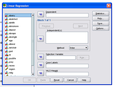
On the left is the list of variables. Find your dependent variable. In our example it is "sprscale." We move that over to the "Dependent" box with the arrow. Then find your independent variable. In our example it is "relscale." We move that over to the "Independent(s):" box:

While there are a number of additional options that can be selected, the basic options are sufficient for example. Thus, choose "OK" and you'll get the following in the Output Window:

The first table simply tells you which variables are included in the analysis and how they are included (i.e., which is the independent and which is the dependent variable).
The second table provides a "Model Summary," which we'll return to in a moment. The third table is an ANOVA, which is useful for a variety of statistics, but we are going to skip it in this chapter at the present.
The fourth table provides the regression statistics of most interest to our present efforts. The first column, "B", in the second row (not the first row labeled "(Constant)") provides the slope coefficient for the independent variable. What this means is that, for every 1 unit change in our independent variable, there is an XX unit change in the dependent variable. In our example, every 1 point increase in the 10 point religiosity scale results in a .506 point increase in the spirituality scale. This tells us that the relationship between the two variables we noticed in the scatterplot was accurate - the relationship is positive.
The second column, labeled "Std. Error," provides a standard error for the slope coefficient. The third column, "Beta," provides a standardized version of the slope coefficient (in a bivariate regression, this is also the correlation coefficient or "r"). What this means is that for every 1 standard deviation unit change in the independent variable there is a corresponding XX standard deviation unit change in the dependent variable. This is less intuitive than the slope coefficient for most variables. The fourth column, "t," is the t statistic. The fifth column, "Sig.", provides the p-value for the slope coefficient of the independent variable. In our example, the p-value is .000, which is less than a standard alpha of .05, suggesting the odds of finding the linear relationship we did between religiosity and spirituality by chance, assuming there is not in fact a relationship, is less than 1 in 1,000. In other words, we can reject the null hypothesis that there is no relationship between the two variables and accept the alternative hypothesis that there is a significant relationship between religiosity and spirituality. In practical terms, more religious genetic counselors tend to be more spiritual as well.
The first row in the fourth table provides statistics for the constant, or y-intercept. Of greatest interest to us in this chapter is the value in column "B". That value is the y-intercept, or the point at which the regression line crosses the y-axis. In our example, it is 3.822. What that means, then, is that when religiosity is zero for genetic counselors, spirituality is predicted to be 3.822.
Returning to the second table, the astute reader will notice that the first column, "R", is identical to the Beta column in the fourth table. As noted, the standardized slope coefficient in a bi-variate regression is the equivalent of the correlation coefficient or "r". The second column is the R-square statistic, which is the proportion of variability in a data set that is accounted for by the statistical model. Basically, the R-square statistic can be interpreted as saying the following: Religiosity explains 34.2% of the variation in spirituality.
Finally, to illustrate the regression line as an actual line of best fit for the many cases in our dataset, we have included another scatterplot with the regression line:

This graph illustrates that the regression line tries to minimize the variation between all of the points in the scatterplot, providing a best estimate of the dependent variable (spirituality) for each value of the independent variable (religiosity). It also shows the regression line crossing the y-axis at the value noted above - 3.822.
The above explanation should provide individuals with sufficient information to run a regression analysis and interpret it in SPSS.
SPSS syntax
[edit | edit source]What Is Syntax?
[edit | edit source]Syntax is computer programming language. SPSS use a specific form of syntax that is unique to SPSS. Although the nature of SPSS does not require that you utilize syntax, it can be your friend. Knowledge of syntax is particularly beneficial if you are repeating the same task in SPSS with different variables; it can save you from tedious, repetitive clicks.
Starting Simple: Frequency Tables
[edit | edit source]Using the example data set on genetic counselors, suppose you want a frequency table for the variable “attend” because you want an idea of how often genetic counselors are attending religious services. In SPSS click “Analyze” → “Descriptive Statistics” → “Frequencies” (this is covered in more depth in Chapter 14). Select the variable “attend.” After you click “continue,” this should show up in your output window:

Now, suppose you want a frequency table of the variable “relig” in order to see what religions many of the genetic counselors identify with. You could repeat the above procedure but choose “relig” instead of “attend.” Or you can use syntax.
To begin using syntax, go to “File” → “New” → “Syntax,” like this:

A new white window will pop up that looks like this:

This window is the Syntax Editor window and it allows you to control the many statistical tests available in SPSS (and many other functions) using programming language rather than point and click mouse movements.
One of the easiest ways to get started using syntax is simply to change your Preferences in SPSS to include syntax in the Output Window (see Chapter 7). You can then use that syntax to run the same commands or similar commands in the Syntax Editor window.
Returning to the example... Since we want to run the frequencies on the variable “relig,” we can start by returning to the original output window where you can copy the syntax from your original command just above the frequency table. The syntax is located in the red box below:

To copy the syntax, you will have to double-click on it, then select it and hit CTRL+C (the copy command in most operating systems). Now return to the Syntax Editor window and paste the syntax into the blank syntax window you have already opened, it should look like this:

While it is beyond the scope of this chapter to explain all of the syntax commands available in SPSS, the above commands are relatively straightforward. Let's begin with the first word:
- FREQUENCIES
This is a command that will tell SPSS which statistical test to perform. In our case, we simply want Frequencies. The second word is paired with an equals sign and includes our variable of interest:
- VARIABLES=attend
This is a modifier for the first word, FREQUENCIES, that tells SPSS which variables will be analyzed. The last part of the syntax simply tells SPSS how to organize the analysis and output:
- /ORDER=ANALYSIS.
The period “.” at the end of ANALYSIS tells SPSS that is the end of a series of commands, so the software knows where this small program ends.
Now, erase the word “attend” and replace it with the word “relig,” which is the name of the religious affiliation variable in our example dataset, and click the blue arrow which tells SPSS to run the syntax. The blue arrow is circled below:

The new frequency table for the variable “relig” should pop up in your output box. Voila! You have successfully run a small computer program using SPSS syntax. Your output window will now have frequencies for both variables and should look like this:

Another Example: ANOVA
[edit | edit source]This same idea of copying the syntax and using it in the Syntax Editor to quickly run repetitive tasks can be illustrated using several of the variables in the example data set. Let's pretend you want to know if the religiosity of genetic counselors varies by their attitudes towards women obtaining abortions. In our sample data set there are seven variables examining attitudes toward abortion, each for a different reason. You could run the ANOVA seven times, pointing and clicking through the menus each time for each of the seven abortion attitudes variables. Or you can run it once, copy the syntax, paste it six times into the Syntax Editor, and simply replace the independent variable with the other six abortion attitude variables.
To run the initial ANOVA, click “Analyze” → “Compare Means” → “One-Way Anova” (covered in more detail in Chapter 21). For the dependent variable, you would select “relscale” and in the “Factor” box (which is where the independent variable goes), put the first abortion attitudes variable, “abpoor.” Run the test and you'll see this:

Now, if we wanted to see if the religiosity of genetic counselors varies by their attitudes towards women getting abortions because they are single and do not wish to marry the father of their unborn baby (“absingle”), we begin by copying and pasting the syntax from the ANOVA statistical test in the Output Window into the Syntax Editor window. Replace the variable “abpoor” with the variable “absingle.” The syntax window should look like this:

If you wanted to, you could also copy this syntax and paste it five more times, then replace the abortion attitudes variable in the syntax each time. When you're ready, run the test, click “Run.” (Note: You can run all six tests at one time by highlighting them all and selecting “Run”.) In your Output Window you should see this:

Once again, genetic counselors' religiosity varies by their abortion attitudes. However, regardless of whether or not the results show there is no significant relationship, what is important is that you can save time and energy by using syntax, particularly when you have a repetitive task you need to run many times. This chapter has only scratched the surface of syntax in SPSS; it can be used to run the entire program, avoiding the Data Editor window almost entirely. It should also be noted that other statistical software, like SAS and R, rely much more heavily on syntax. SPSS is known for being more user-friendly as it allows people to point and click to run tests.
Chapter contributed by Victoria Blyde.
